Excel Charts
Charts are visual representations of data used to make it more understandable.
Commonly used charts are:
- Pie chart
- Column chart
- Line chart
Different charts are used for different types of data.
Note: Charts are also called graphs and visualizations.

The chart above is a column chart representing the number of Pokemons in each generation.
Note: In some cases the data has to be processed before plotted into a chart.
Charts can easily be created in a few steps in Excel.
Creating a Chart in Excel
Creating a chart, step by step:
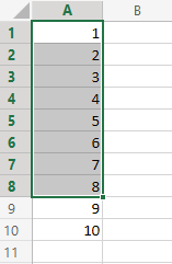
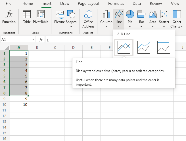
-
Select the range
A1:A8
-
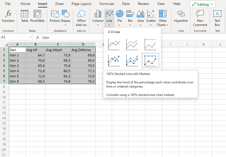
Click on the Insert menu, then click on the Line menu (
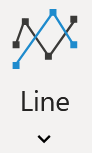 ) and choose Line (
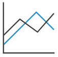 ) from the drop-down menu
Note: This menu is accessed by expanding the ribbon.
You should now get this chart:
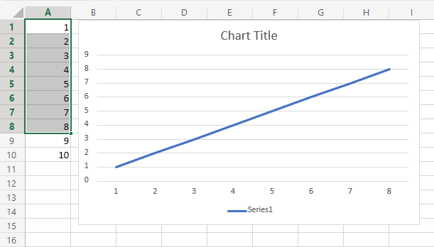
Excellent! You have now created your first chart.
Note: The cells 9 and 10 were not selected in the range, and therefore not included in the graph.
Creating Another Chart in Excel
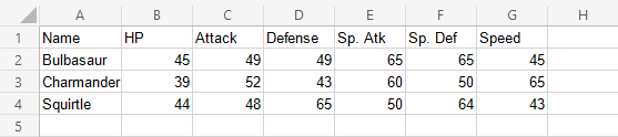
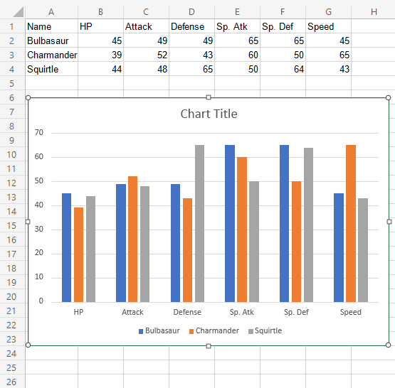
Lets compare the stats for the Pokemons; Charmander, Squirtle and Bulbasaur using a column chart.
- Select the range
A1:G4
- Click on the insert menu, then click on the column menu (
 ) and choose Clustered Column (
 ) from the drop-down menu
Note: This menu is accessed by expanding the ribbon.
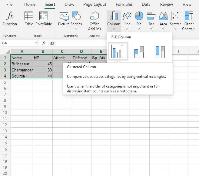
You should now get this chart:
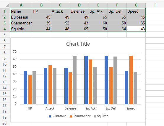
The chart gives a visual overview for the Pokemons stats.
Charmander, represented by the orange bars, and has the highest speed. Squirtle, represented by the gray bars, has the highest defense.
Note: The default chart title is “Chart Title”. It can be changed. You will learn about chart customization in a later chapter.
Bar Charts
Bar charts show the data as horizontal bars.
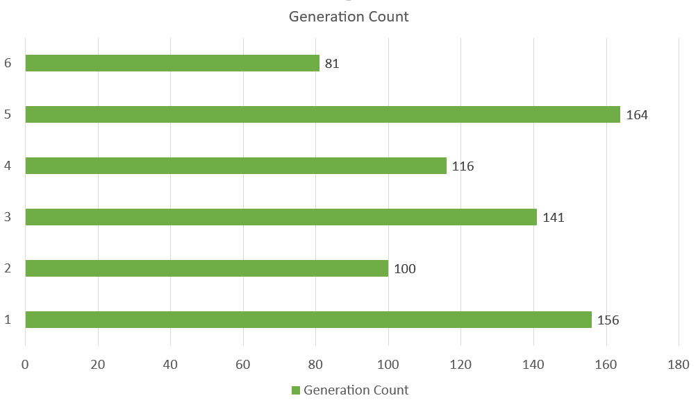
The chart above represents the number of Pokemons in each generation.
Similar to column charts, bar charts are suited for representing values of qualitative (categorical) data.
Note: You can read more qualitative (categorical) data at Statistics Data Types.
There are three different type of bar charts:
- Clustered bar(
 )
) - Stacked bar(
 )
) - 100% stacked bar(
 )
)
Clustered Bar Chart
Clustered Bar charts are used when the value of data is important but the order is not.
Example With One Data Column
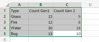
We want to find the number of generation 1 Pokemons with types “Grass”, “Fire”, “Water” and “Bug”.
You can copy the values to follow along:
- Select the range
A1:B5
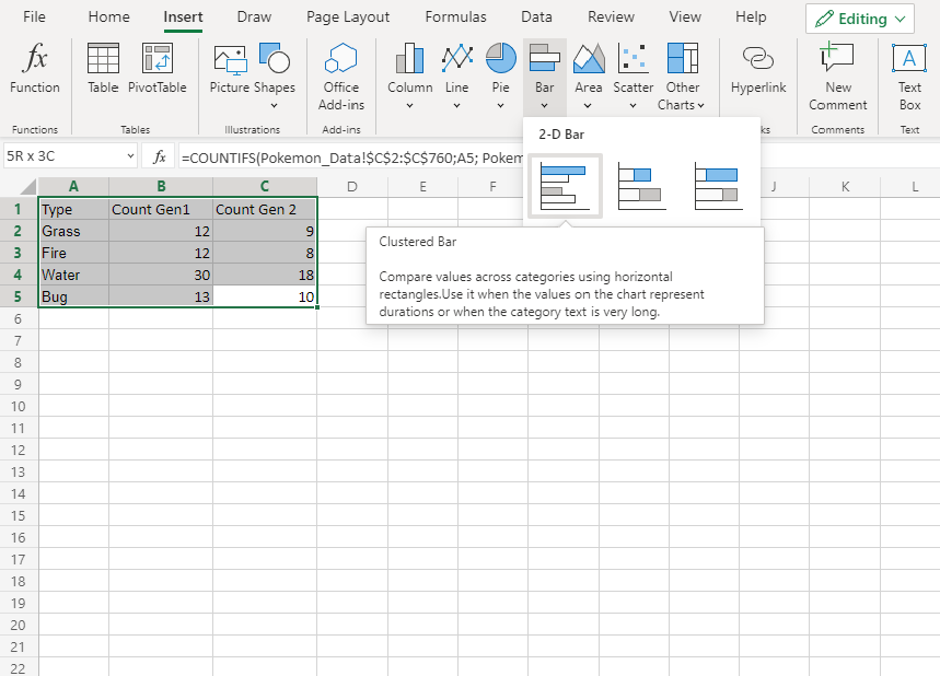
- Click on the insert menu, then click on the bar menu (
 ) and choose Clustered Bar () from the drop-down menu
Note: This menu is accessed by expanding the ribbon.
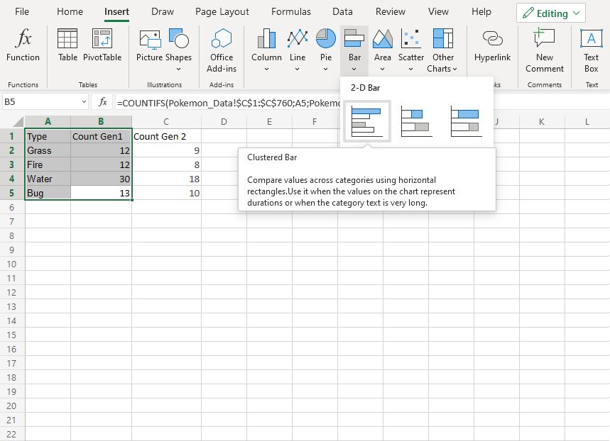
Well Done! Following the steps above will give you the chart below.
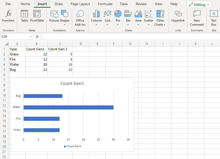
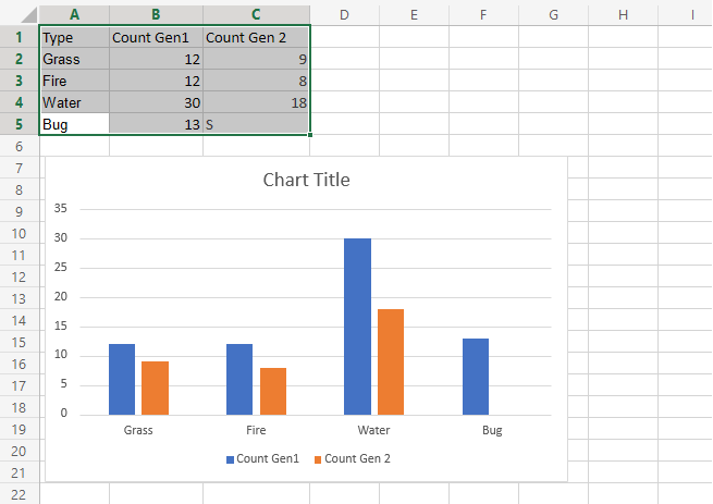
The chart gives a visual overview for the “Grass”, “Fire”, “Water” and “Bug” type Pokemons in generation 1.
Type “Water” has the most Pokemons in the first generation.
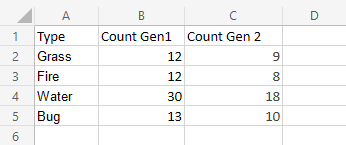
Example With Two Data Columns
Now let’s do the same for generation 2 Pokemons and compare the results with the last example.
- Select the range
A1:C5
- Click on the insert menu, then click on the bar menu () and choose Clustered Bar () from the drop-down menu
Note: This menu is accessed by expanding the ribbon.
You should get the chart below:
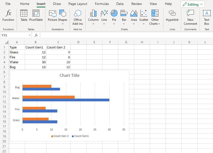
The chart gives a visual overview for the “Grass”, “Fire”, “Water” and “Bug” type Pokemons in generation 1 and 2.
Generation 1 is shown in blue and generation 2 is shown in orange.
Type “Water” has the most Pokemons in both generations
Also, all the types in generation 2 have less members than generation 1.
Stacked Bar Chart
Stacked bar charts are used to highlights the total amount of contribution for each category.
This is done by stacking the bars at the end of each other.
The charts are used when you have more than one data column.
Example
We want to find out the total number of generation 1 and 2 Pokemons in each of these type 1 categories: “Grass”, “Fire”, “Water” and “Bug”.
You can copy the values to follow along:
- Select the range
A1:C5
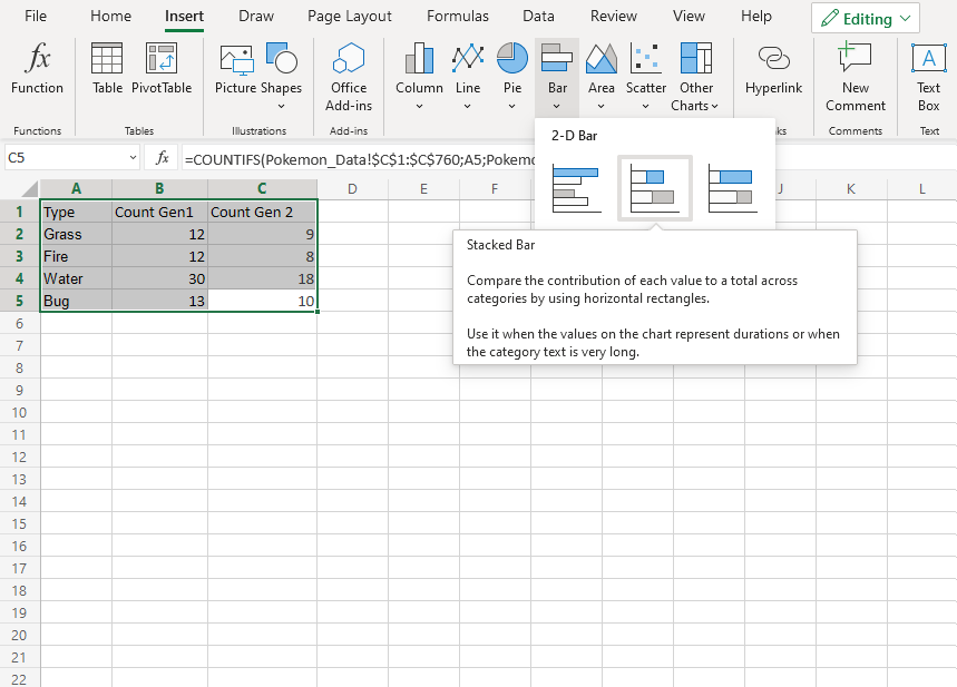
- Click on the insert menu, then click on the bar menu () and choose Stacked Bar () from the drop-down menu
Note: This menu is accessed by expanding the ribbon.
Following the steps above, you will get the following chart:

The chart gives a visual overview for the total number of “Grass”, “Fire”, “Water” and “Bug” type Pokemons in both generation 1 and 2.
Generation 1 Pokemons are shown in blue and generation 2 Pokemons are shown in orange.
This chart shows that “Water” type Pokemons are the most common and “Fire” type Pokemons are the least common.
100% Stacked Bar Chart
100% Stacked Bar is used to highlights the proportion of contribution for each data column in a category.
This is done by scaling the total value of each category in a stacked bar chart to 100.
The charts are used when you have more than one data column.
Example
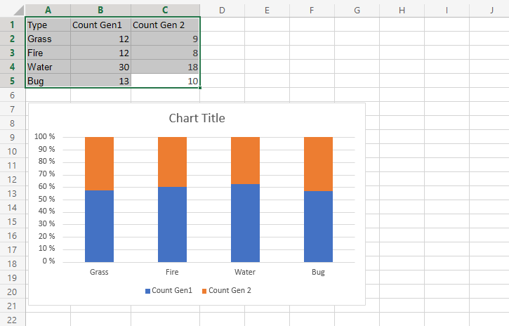
We want to find out the proportion of Pokemon types “Grass”, “Fire”, “Water” and “Bug” in generation 1 and 2.
You can copy the values to follow along:
- Select the range
A1:C5
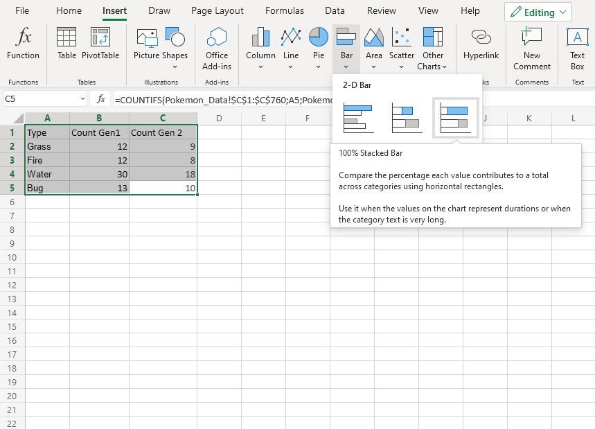
- Click on the insert menu, then click on the bar menu () and choose 100% Stacked Bar () from the drop-down menu
Note: This menu is accessed by expanding the ribbon.
Following the steps above, you will get the following chart:
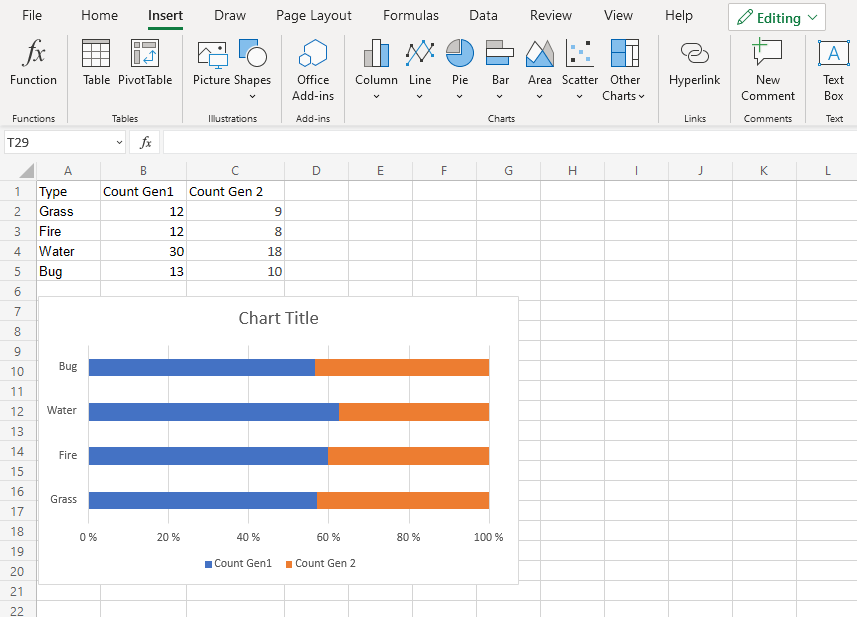
The chart gives a visual overview for the proportion of “Grass”, “Fire”, “Water” and “Bug” type Pokemons in both generation 1 and 2.
Generation 1 Pokemons are shown in blue and generation 2 Pokemons are shown in orange.
This chart shows that more than half of Pokemons are in generation 1.
Column Charts
Column charts show the data as vertical bars.
Column charts are suited for representing values of qualitative (categorical) data.
Note: You can read more qualitative (categorical) data at Statistics Data Types.
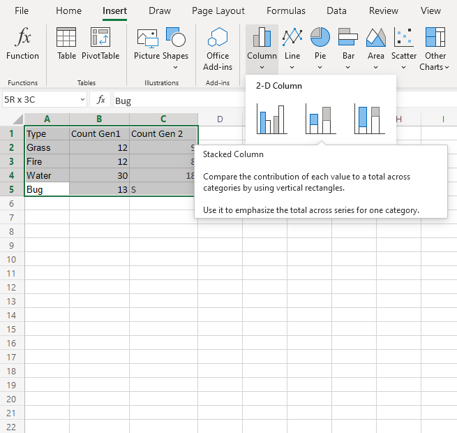
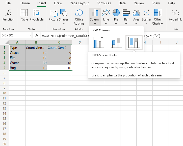
Excel has three different types of column charts:
- Clustered column()
- Stacked column(
 )
) - 100% Stacked column(
 )
)
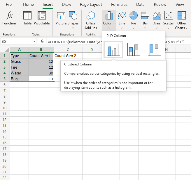
Clustered Column Chart
Clustered Column charts are used when the value of data is important but the order is not.
Example With One Data Column
We want to find the number of generation 1 Pokemons with types “Grass”, “Fire”, “Water” and “Bug”.
You can copy the values to follow along:
- Select the range
A1:B5
- Click on the insert menu, then click on the column menu () and choose Clustered Column () from the drop-down menu
Note: This menu is accessed by expanding the ribbon.
Nicely Done! Following the steps above will give you the chart below.
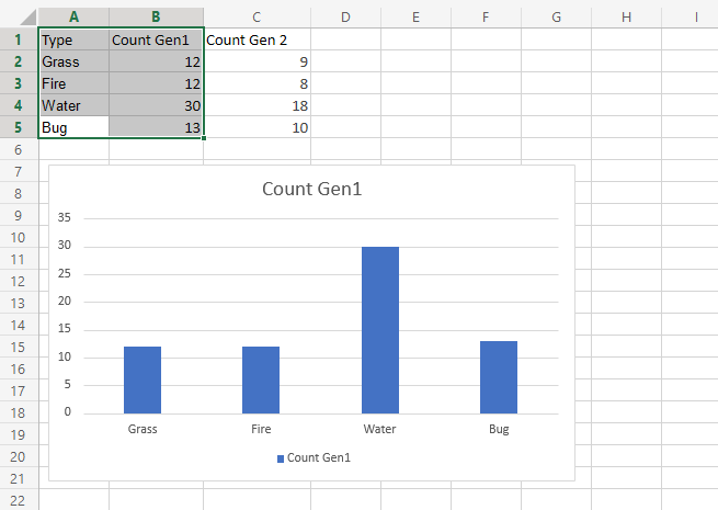
The chart gives a visual overview for the “Grass”, “Fire”, “Water” and “Bug” type Pokemons in generation 1.
Type “Water” has the most Pokemons in the first generation.
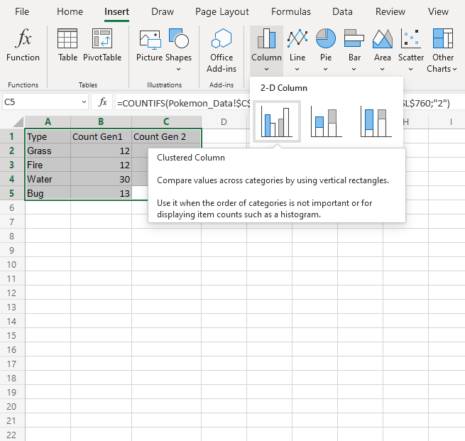
Example With Two Data Columns
Now let’s do the same for generation 2 Pokemons and compare the results with the last example.
- Select the range
A1:C5
- Click on the insert menu, then click on the column menu () and choose Clustered Column () from the drop-down menu
Note: This menu is accessed by expanding the ribbon.
You should get the chart below:
The chart gives a visual overview for the “Grass”, “Fire”, “Water” and “Bug” type Pokemons in generation 1 and 2.
Generation 1 is shown in blue and generation 2 is shown in orange.
Type “Water” has the most Pokemons in both generations
Also, there are more Pokemons in generation 1 than 2.
Stacked Column Chart
Stacked Column charts are used to highlights the total amount of contribution for each category.
This is done by stacking columns on top of each other.
The charts are used when you have more than one data column.
Example
We want to find out the total number of generation 1 and 2 Pokemons in each of these type 1 categories: “Grass”, “Fire”, “Water” and “Bug”.
You can copy the values to follow along:
- Select the range
A1:C5
- Click on the insert menu, then click on the column menu () and choose Clustered Column () from the drop-down menu
Note: This menu is accessed by expanding the ribbon.
Following the steps above, you will get the following chart:
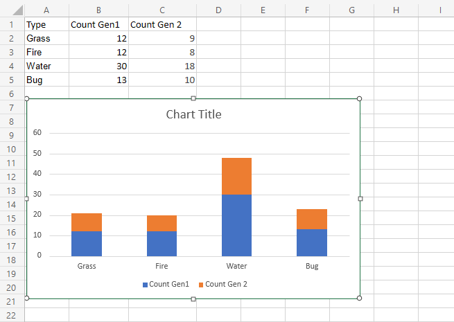
The chart gives a visual overview for the total number of “Grass”, “Fire”, “Water” and “Bug” type Pokemons in both generation 1 and 2.
Generation 1 Pokemons are shown in blue and generation 2 Pokemons are shown in orange.
This chart shows that “Water” type Pokemons are the most common and “Fire” type Pokemons are the least common.
100% Stacked Column Chart
100% Stacked Column is used to highlights the proportion of contribution for each data column in a category.
This is done by scaling the total value of each category in a stacked column chart to 100.
The charts are used when you have more than one data column.
Example
We want to find out the proportion of Pokemon types “Grass”, “Fire”, “Water” and “Bug” in generation 1 and 2.
You can copy the values to follow along:
- Select the range
A1:C5
- Click on the insert menu, then click on the column menu () and choose Clustered Column () from the drop-down menu
Note: This menu is accessed by expanding the ribbon.
Following the steps above, you will get the following chart:
The chart gives a visual overview for the proportion of “Grass”, “Fire”, “Water” and “Bug” type Pokemons in both generation 1 and 2.
Generation 1 Pokemons are shown in blue and generation 2 Pokemons are shown in orange.
This chart shows that more than half of Pokemons are in generation 1.
Pie Charts
Pie charts arrange the data as slices in a circle.
Pie charts are used for representing values of qualitative (categorical) data.
Pie charts show the contribution of each category to the total.
Note: You can read more about qualitative (categorical) data at Statistics Data Types.
Excel has two types of pie charts:
- 2-D pie (
 )
) - Doughnut (
 )
)
2-D Pie Chart
Pie charts arrange the data as slices in a circle.
2-D pie charts are used when you only have one data column.
Example
Showing the proportion of 1st generation Grass, Fire, Water, and Bug type Pokemon.
You can copy the values to follow along:
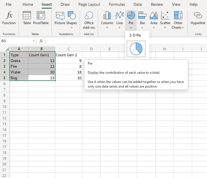
- Select the range
A1:B5
- Click on the Insert menu, then click on the Pie menu (
 ) and choose Pie () from the drop-down menu
Note: This menu is accessed by expanding the ribbon.
You should get the chart below:
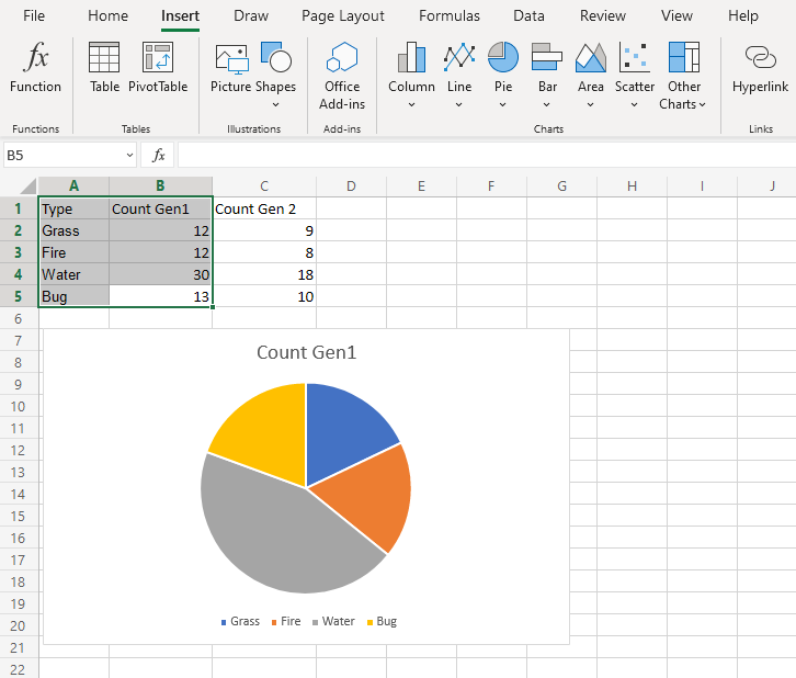
The chart gives a visual overview of the number of 1st generation Grass, Fire, Water and Bug type Pokemon.
Type “Grass” is shown in blue, “Fire” in orange, “Water” in gray and “Bug” in yellow.
Type “Water” has the most Pokemon in the first generation.
Note: The chart can be customized by adding labels. This can make it easier to understand the differences between categories.
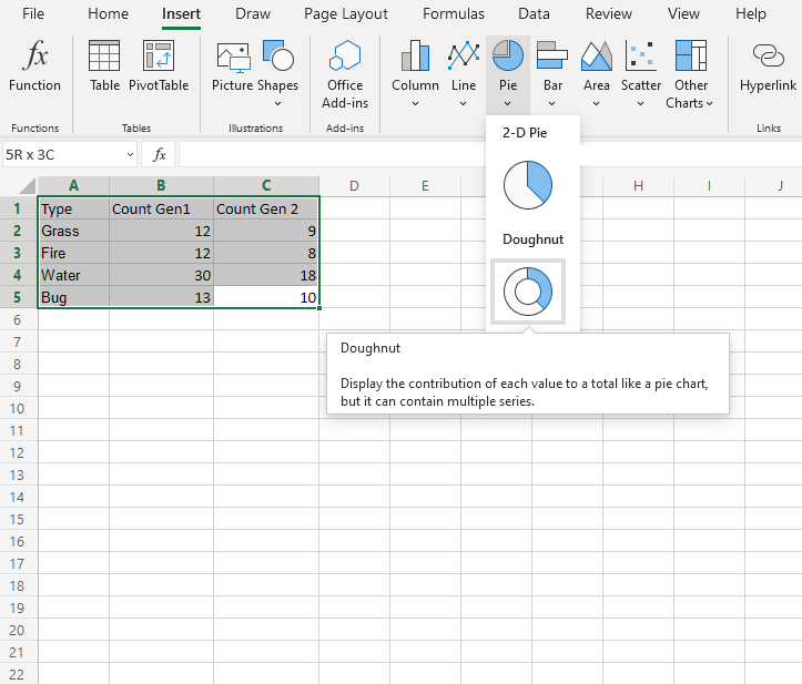
Doughnut Chart
Doughnut charts arrange the data as slices in a circle with hollow center.
Doughnut charts are often used when you have more than one data column.
Note: A doughnut chart with one data column shows the same information as a 2-D pie chart.
Example
We want to find the proportion of types “Grass”, “Fire”, “Water” and “Bug”. in generation 1 Pokemon and compare it to the proportions in generation 2.
You can copy the values to follow along:
- Select the range
A1:C5
- Click on the Insert menu, then click on the Pie menu () and choose Doughnut () from the drop-down menu
Note: This menu is accessed by expanding the ribbon.
Following the steps above, you will get the following chart:
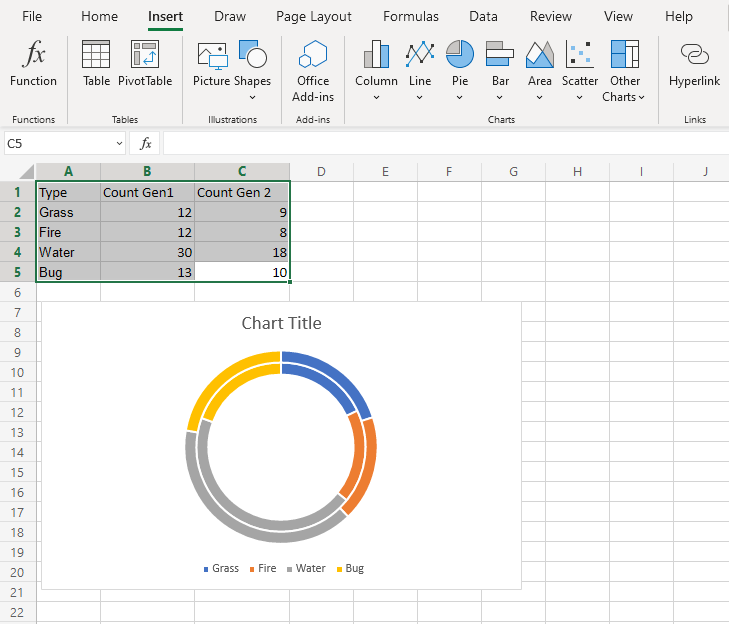
The chart gives a visual overview of the number of 1st and 2nd generation Grass, Fire, Water and Bug type Pokemon.
Generation 1 Pokemon are shown in the inner circle and generation 2 Pokemon are shown in the outer circle.
Type “Grass” is shown in blue, “Fire” in orange, “Water” in gray and “Bug” in yellow.
This chart shows that “Water” type Pokemon are the most common in both generations.
Note: The chart can be customized by adding labels. This can make it easier to understand the differences between different categories.
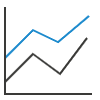
Line Charts
Line charts show the data as a continuous line.
Line charts are typically used for showing trends over time.
In Line charts, the horizontal axis typically represents time.
Line charts are used with data which can be placed in an order, from low to high.
Note: Data which can be placed in an order, from low to high, like numbers and letter grades from A to F are called ordinal data. You can read more about ordinal data at Statistics – Measurement Levels.
Excel has six types of line charts:
- Line (
 )
) - Line with Markers (
 )
) - Stacked Line (
 )
) - Stacked Line with Markers (
 )
) - 100% Stacked Line (
 )
) - 100% Stacked Line with Markers (
 )
)
Line
Line charts are used for showing data ordered from low to high.
Example
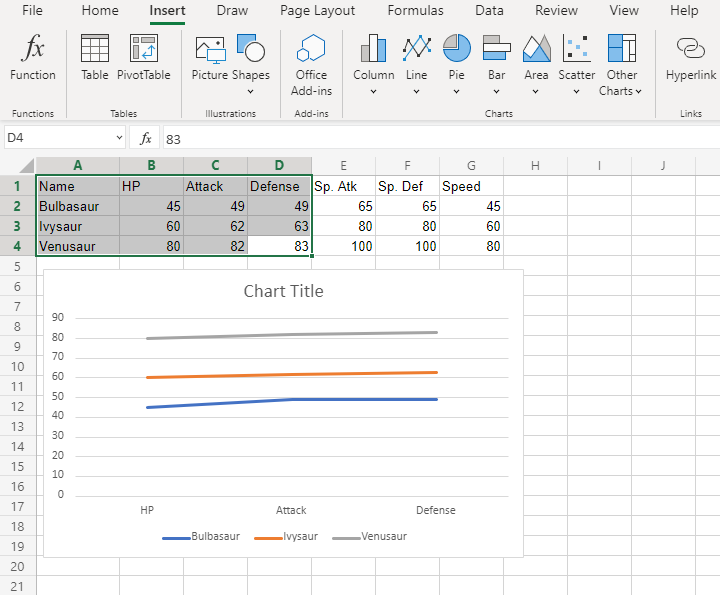
Let’s see the stats change for Bulbasaur evolutions.
Copy the values to follow along:
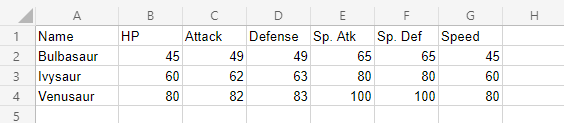
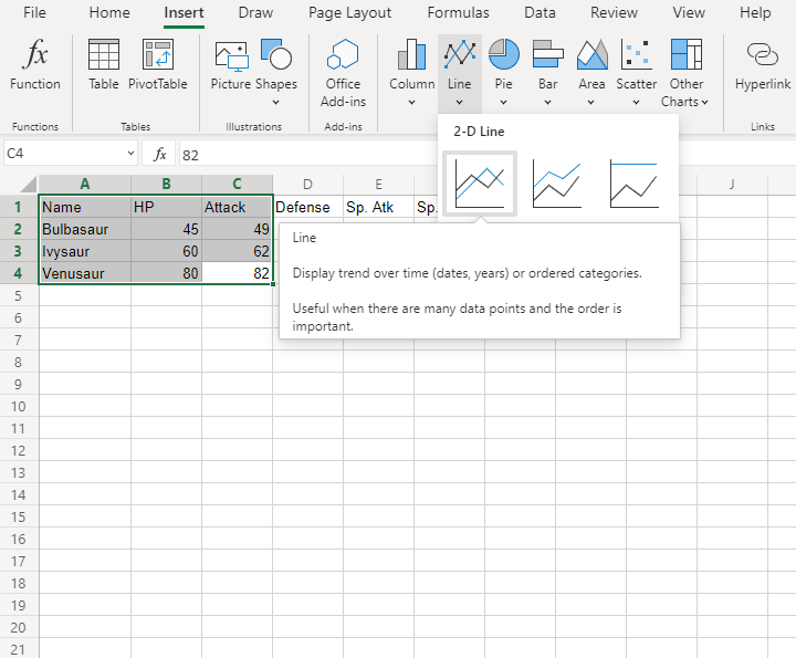
- Select the range
A1:C4for labels and data
Note: This menu is accessed by expanding the ribbon.
- Click on the Insert menu, then click on the Line menu () and choose Line () from the drop-down menu
You should get the chart below:
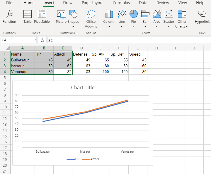
The chart gives a visual overview for the Pokemon stats.
Bulbasaur evolutions are shown on the horizontal axis.
HP stat is shown in blue and Attack stat is shown in orange.
The chart shows that with each evolution, the stats increase.
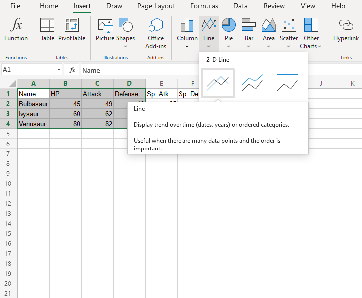
Fantastic! Now let’s plot more stats on the chart.
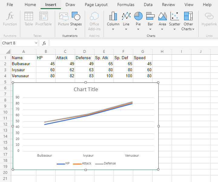
- Select the range
A1:D4for labels and data
- Click on the Insert menu, then click on Line menu () and choose Line () from the drop-down menu
You should get the chart below:
Wait a minute. Something doesn’t seem right.
Suddenly, Bulbasaur’s evolutions are not shown on the horizontal axis. Instead, it is the stats.
What’s happening?
Note: Excel checks the number of rows and columns included in the chart and automatically places the larger number on the horizontal axis.
Luckily, there is a simple fix.
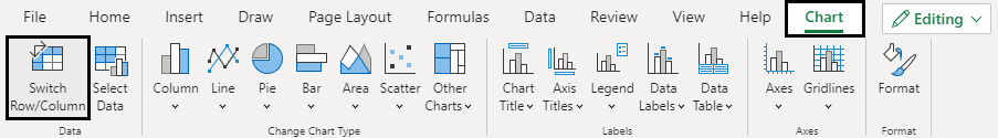
Click on the the chart, then chick on the Chart tab and finally Click on Switch Row/Column.
The outcome is this chart which has Bulbasaur evolutions on the horizontal axis.
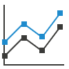
Line with Markers
Line with markers highlights data points with markers on a line chart.
Example
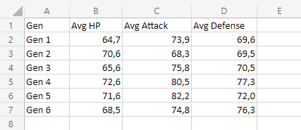
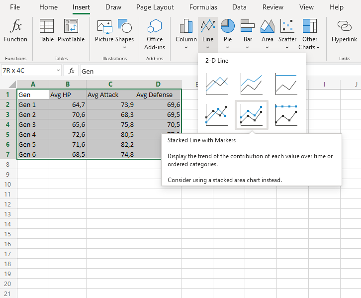
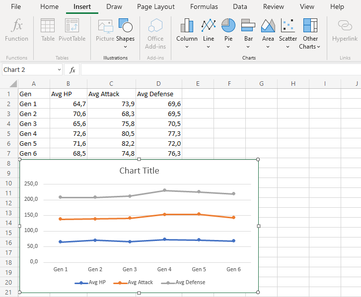
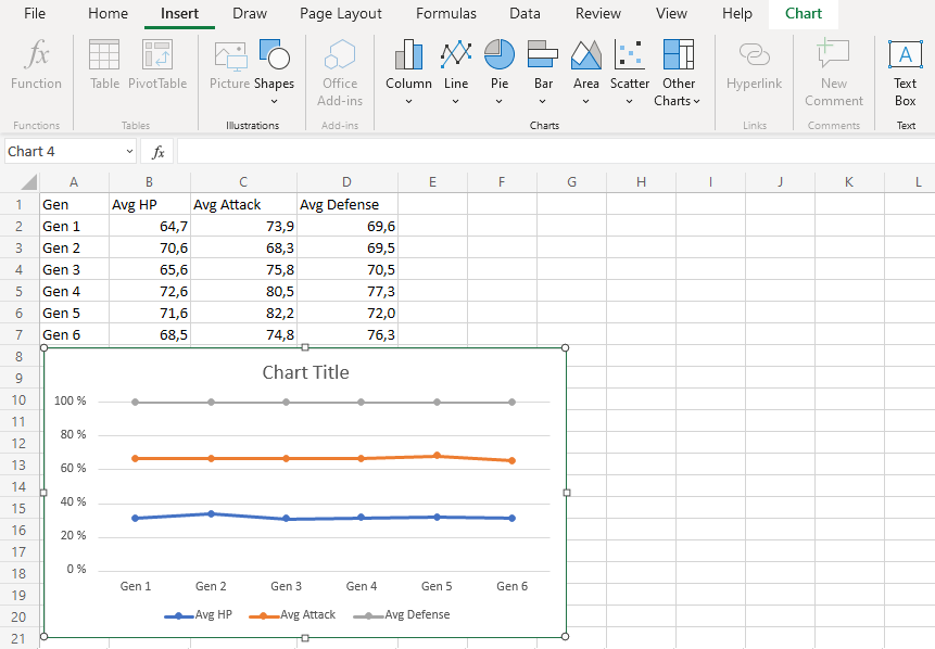
Let’s chart the average HP, Attack and Defense over all the Pokemon generations.
Copy the values to follow along:
Note: This data is rounded to one decimal.
- Select the range
A1:D7for labels and data
Note: This menu is accessed by expanding the ribbon.
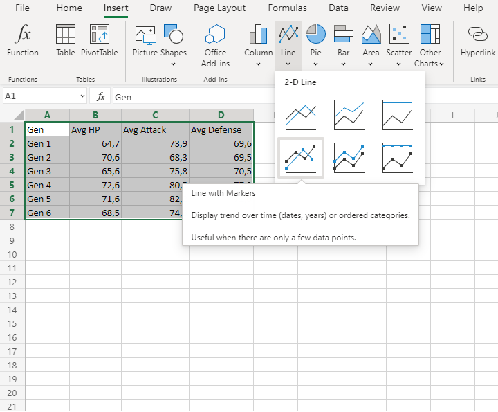
- Click on the Insert menu, then click on the Line menu () and choose Line with Markers () from the drop-down menu
You should get the chart below:
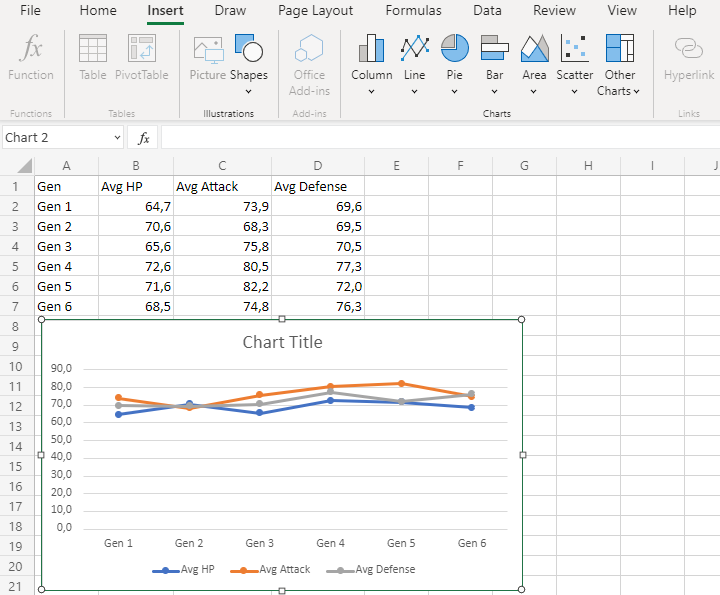
The chart gives a visual overview for average Pokemon stats over generations.
Average HP is shown in blue, average attack is shown in orange and average defense is shown in gray.
The horizontal axis shows the generations.
This chart shows that the average of all stats in the 2nd generation is very close to each other and 5th generation Pokemon have on average the highest attack.
Stacked Line
Stacked Line charts show the contribution to trends in the data.
This is done by stacking lines on top of each other.
Stacked Line charts are used with data which can be placed in an order, from low to high.
The charts are used when you have more than one data column which all add up to the total trend.
Note: Data which can be placed in an order, from low to high, like numbers and letter grades from A to F are called ordinal data. You can read more about ordinal data at Statistics – Measurement Levels.
Example
Let’s see how the average stats add up across Pokemon generations
Copy the values to follow along:
Note: This data is rounded to one decimal.
- Select the range
A1:D7for labels and data
Note: This menu is accessed by expanding the ribbon.
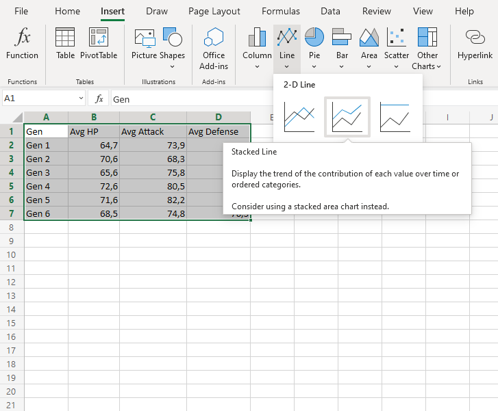
- Click on the Insert menu, then click on the Line menu () and choose Stacked Line () from the drop-down menu
You should get the chart below:
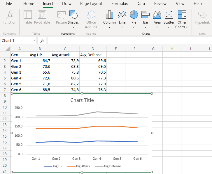
The chart gives a visual overview for the average Pokemon stats over generations.
The blue line shows the average HP, the orange line show the addition of average HP and Average attack. Finally, the gray line shows the sum of all the stats once all the average stats are added.
This chart shows that 4th generation Pokemon have the highest stats on average.
Stacked Line with Markers
Stacked line with markers highlights data points with markers on a stacked line chart.
Example
Let’s see how the average stats add up across Pokemon generations
Copy the values to follow along:
Note: This data is rounded to one decimal.
- Select the range
A1:D7for labels and data
Note: This menu is accessed by expanding the ribbon.
- Click on the Insert menu, then click on the Line menu () and choose Stacked Line with Markers () from the drop-down menu
You should get the chart below:
The chart gives a visual overview for the average Pokemon stats over generations.
The blue line shows the average HP, the orange line show the addition of average HP and Average attack. Finally, the gray line shows the sum of all the stats once all the average stats are added.
This chart shows that 4th generation Pokemon have the highest stats on average.
100% Stacked Line
100% Stacked Line charts show the proportion of contribution to trends in the data.
This is done by scaling the lines so that the total is 100%.
100% Stacked Line charts are used with data which can be placed in an order, from low to high.
The charts are used when you have more than one data column which all add up to the total trend.
Note: Data which can be placed in an order, from low to high, like numbers and letter grades from A to F are called ordinal data. You can read more about ordinal data at Statistics – Measurement Levels.
Example
Let’s see how the average stats add up across Pokemon generations
Copy the values to follow along:
Note: This data is rounded to one decimal.
- Select the range
A1:D7for labels and data
Note: This menu is accessed by expanding the ribbon.
- Click on the Insert menu, then click on the Line menu () and choose 100% Stacked Line () from the drop-down menu
You should get the chart below:
The chart gives a visual overview for the average Pokemon stats over generations.
The blue line shows how much the average HP contribute to the overall. The orange line shows how much the average Attack contribute to the total and finally, the gray line shows all the sum of all the stats scaled to 100%.
This chart shows that in the second generation, HP contributes more to the overall compared to other generations.
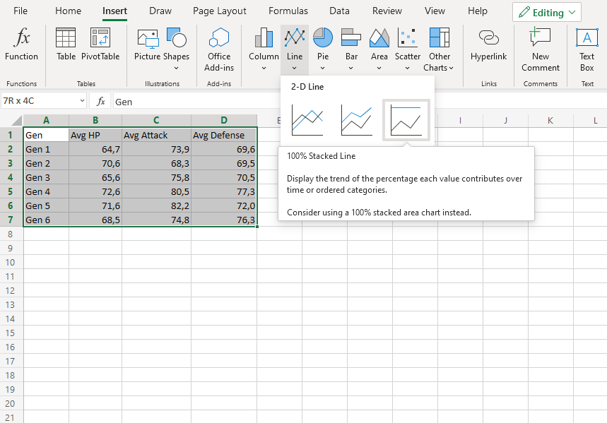
100% Stacked Line with Markers
100% stacked line with markers highlights data points with markers on a 100% stacked line chart.
Example
Let’s see how the average stats add up across Pokemon generations
Copy the values to follow along:
Note: This data is rounded to one decimal.
- Select the range
A1:D7for labels and data
Note: This menu is accessed by expanding the ribbon.
- Click on the Insert menu, then click on the Line menu () and choose 100% Stacked Line with Markers () from the drop-down menu
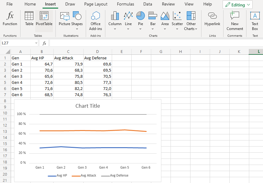
You should get the chart below:
The chart gives a visual overview for the average Pokemon stats over generations.
The blue line shows how much the average HP contribute to the overall. The line orange line shows how much the average Attack contribute to the total and finally, the gray line shows all the sum of all the stats scaled to 100%.
This chart shows that in the 2nd generation, HP contributes more to the overall compared to other generations.
Radar Charts
Radar charts show multivariate data as values relative to a center point.
Note: Multivariate data has more than one variables. For example, a dataset containing age and height is multivariate because it has two variables.
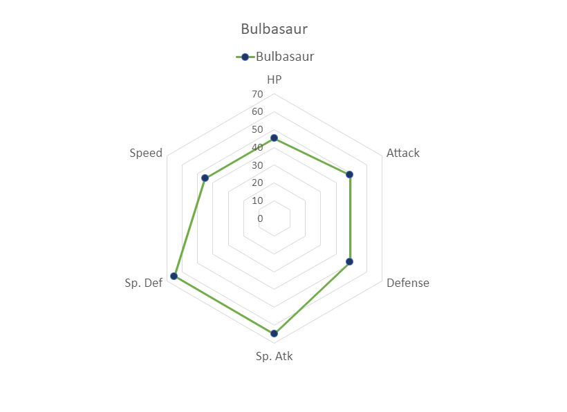
Radar charts can only show data that can be ordered from low to high.
Note: Data which can be placed in an order, from low to high, like numbers and letter grades from A to F are called ordinal data. You can read more about ordinal data at Statistics – Measurement Levels.
Radar charts are suited for showing similarities and outliers in the data.
Note: An outlier is a data point that has unusually large/small values compared to the rest of the data.
Excel has three types of radar charts:
- Radar (
 )
) - Radar with markers (
 )
) - Filled radar (
 )
)
Note: Radar chart is also known as web chart, spider chart and star chart.
Radar
Radar charts show data as as vertices on a polygon.
The relevant distance from the center of the polygon shows the value of the data point.
Example
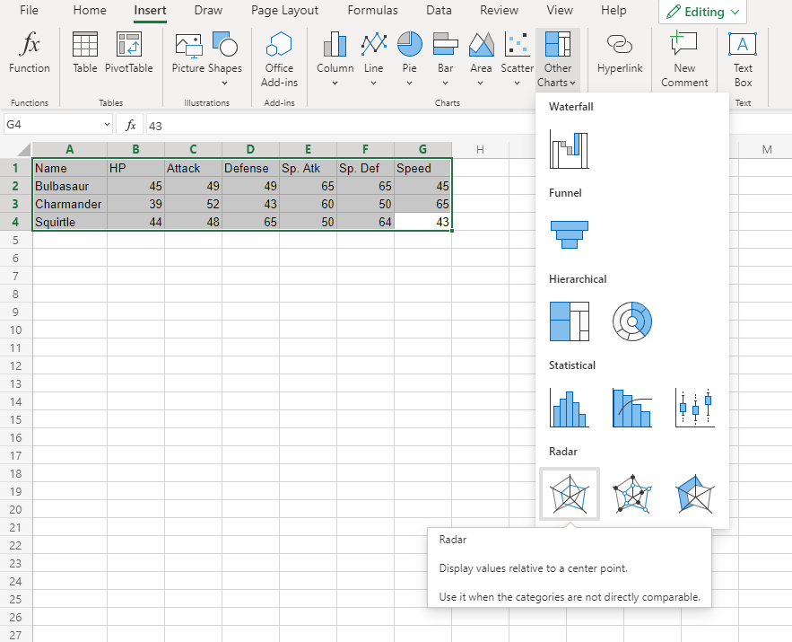
Let’s compare the stats for Bulbasaur, Charmander and Squirtle.
Copy the values to follow along:
- Select the range
A1:G4
Note: This menu is accessed by expanding the ribbon.
- Click on the Insert menu, then click on the Other Charts menu (
 ) and choose Radar () from the drop-down menu
You should get the chart below:
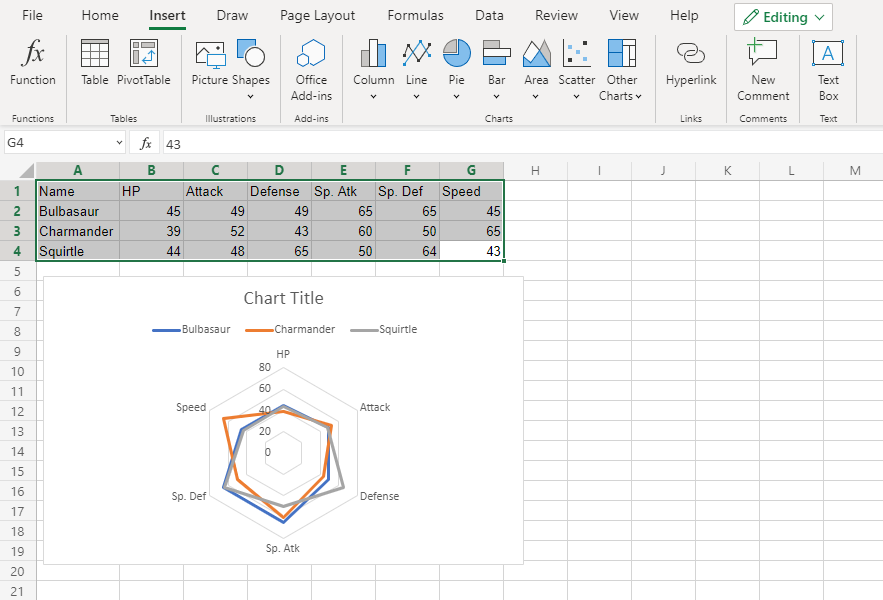
The chart gives a visual overview for the Pokemon stats.
Bulbasaur is shown in blue, Charmander in orange and Squirtle in gray.
The chart shows that Charmander has the highest speed and lowest special defense. Squirtle has the highest defense and lowest special attack. The three Pokemon have similar HP and attack stats.
Radar With Markers
Radar with Markers is similar to radar chart. The only difference is that the data points are highlighted with markers.
Example
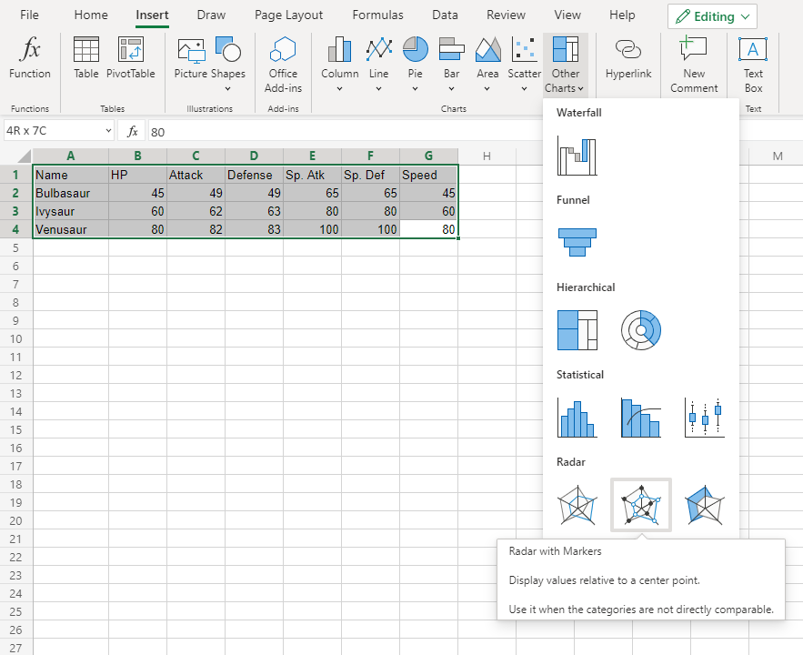
Let’s compare the stats for Bulbasaur evolutions to Ivysaur and Venusaur.
Copy the values to follow along:
- Select the range
A1:G4
Note: This menu is accessed by expanding the ribbon.
- Click on the Insert menu, then click on the Other Charts menu () and choose Radar with Markers () from the drop-down menu
You should get the chart below:
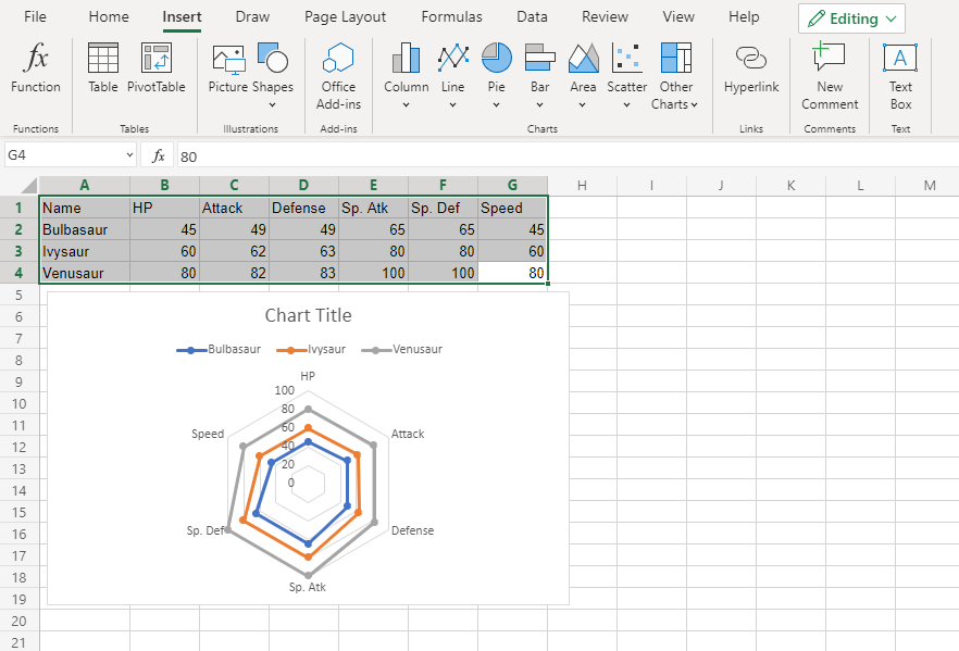
The chart gives a visual overview for the Pokemon stats.
Bulbasaur is shown in blue, Ivysaur in orange and Venusaur in gray.
The chart shows that with each evolution, the stats increase in a similar manner.
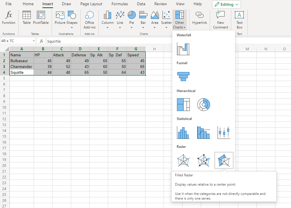
Filled Radar
Filled radar is similar to radar chart. The only difference is that inside the charts are filled with color.
Example
Let’s compare the stats for Bulbasaur, Charmander and Squirtle.
Copy the values to follow along:
- Select the range
A1:G4
Note: This menu is accessed by expanding the ribbon.
- Click on the Insert menu, then click on the Other Charts menu () and choose Radar () from the drop-down menu
You should get the chart below:
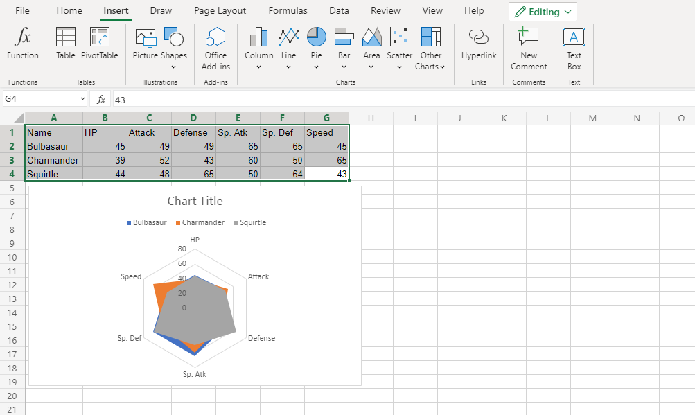
The chart gives a visual overview for the Pokemon stats.
Bulbasaur is shown in blue, Charmander in orange and Squirtle in gray.
The chart shows that Charmander has the highest speed.
Note that since the charts are overshadowing each other, the chart cannot give any more information.
Caution: It’s better to avoid using filled radar charts with multiple data columns because some data columns can overshadow others.
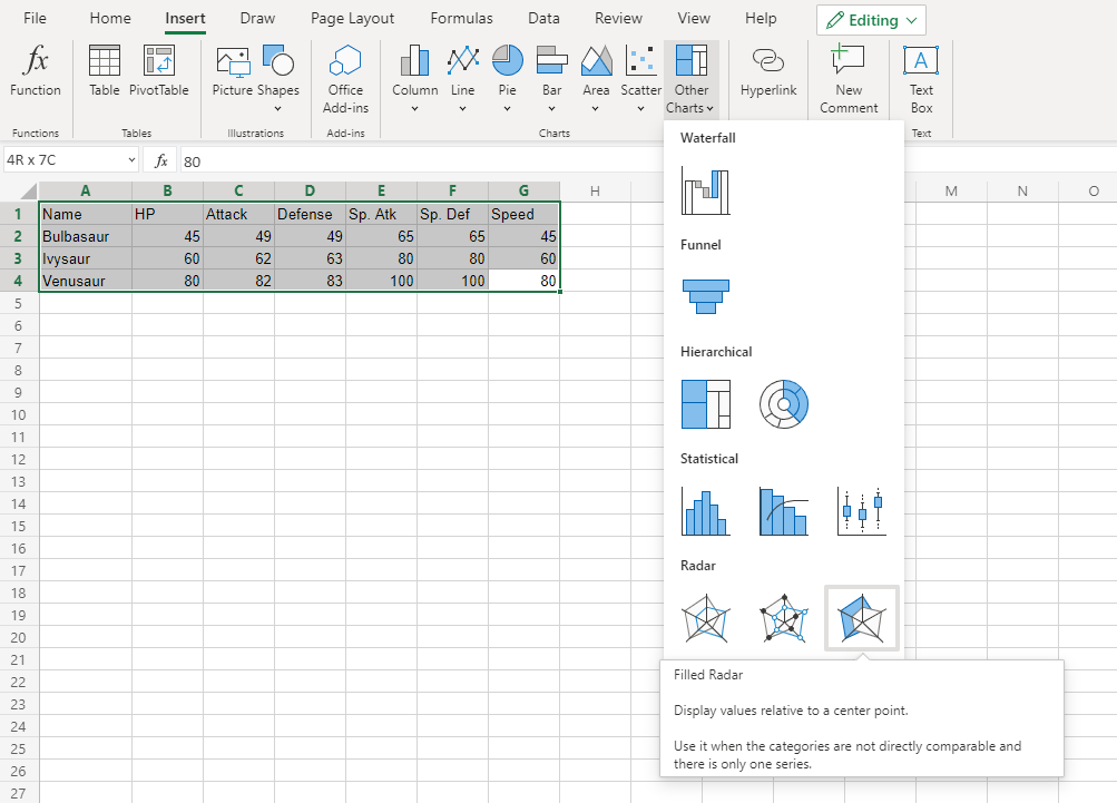
Example (The Extreme Case)
Let’s compare the stats for Bulbasaur evolutions to Ivysaur and Venusaur.
Copy the values to follow along:
- Select the range
A1:G4
Note: This menu is accessed by expanding the ribbon.
- Click on the Insert menu, then click on the Other Charts menu () and choose Radar with Markers () from the drop-down menu
You should get the chart below:
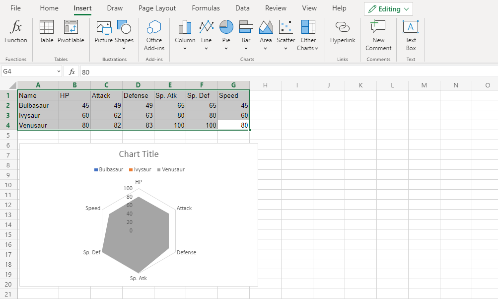
In this chart, Venusaur, which is shown in gray, overshadows all the other Pokemon.
The only information this chart gives is that Venusaur has larger or equal stat values than both Bulbasaur and Ivysaur.
Chart Customization
Charts in Excel can be customized.
Customization can be helpful to make the data easier to understand. For example to highlight key points, give additional information and make it look better.
Excel has many options for how to customize a chart. You will learn more about the different options in this chapter.
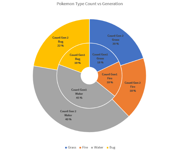
This doughnut chart shows the ratio of different Pokemon types in generations 1 and 2.
The “Water” type, shown in gray has the most Pokemons in both generations. Then there are types “Bug”, shown in yellow, “Grass”, shown in blue and “Fire”, shown in orange.
Note: Different charts can be customized in different ways.
Moving Charts
Excel charts can be moved around the spreadsheet.
How to move a chart, step by step:
-
Select the chart by clicking on it.
Note: Selecting a chart highlights its borders.
-
Drag the chart and place it where you want
Resizing Charts
Excel charts can be resized.
Resizing will scale all the elements in the chart except the text.
How to resize a chart, step by step:
-
Select the chart by clicking on it.
-
Click and drag one of the 8 points shown on the chart border and drag them
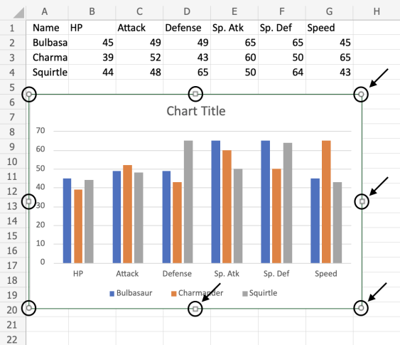
Note: The arrows in the image above are pointing to where you can drag to resize the chart.
The chart is now resized. This can be done as many times as needed to get the right size.
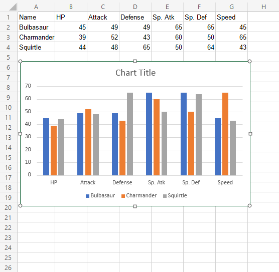
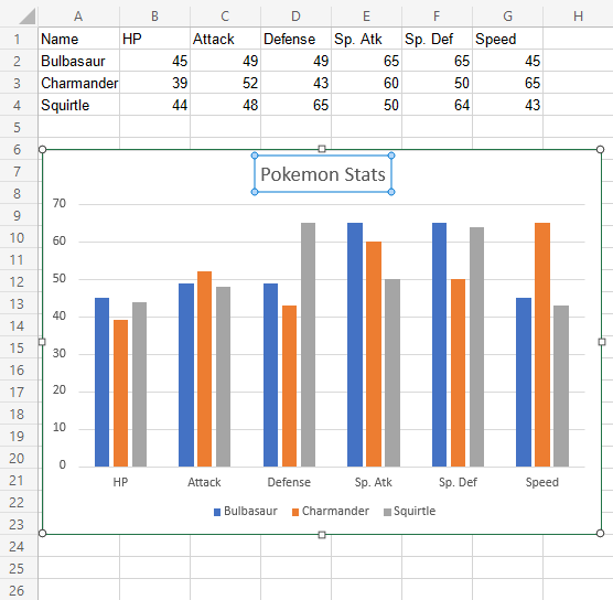
Changing The Chart Title
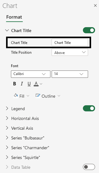
The default chart title in Excel is “Chart Title”. This is not informative. The title should describe the chart.
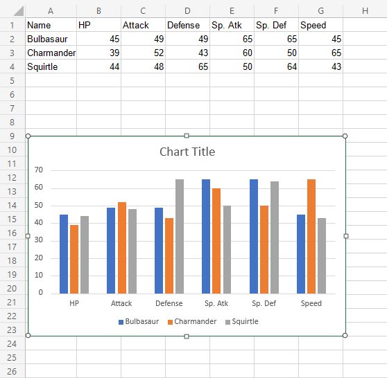
Changing the title, step by step:
-
Double click on the chart
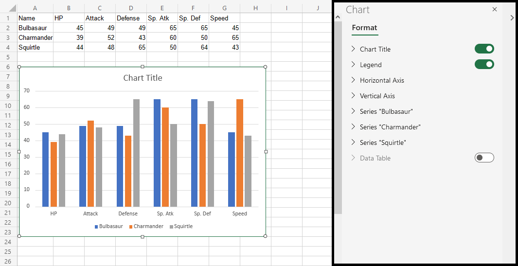
This opens up a menu on the right side of your screen.
-
Find “Chart Title” text in the newly opened menu and change it
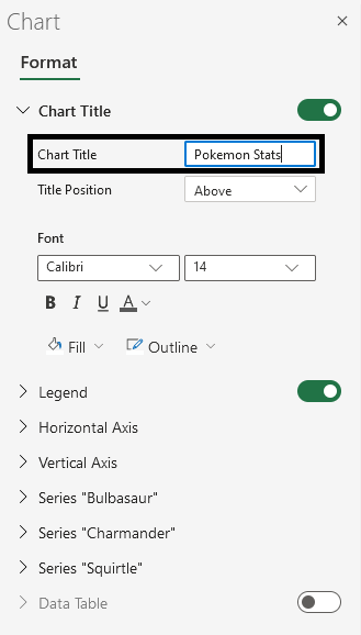
Now, the title has changed to “Pokemon Stats”.
Note: You can remove the chart title by clicking on it and pressing the Deletekey on your keyboard.
Customization Options
Charts can be customized in different ways, here are some elements you can change:
- Legends
- Axis
- Data labels
- Grid lines
- Styling and formatting